
7 Essential Steps For A Mobile-Responsive E-commerce Website Development

Redesigning Your Website – Top Strategies For A Fresh And SEO-Friendly Look
March 21, 2024
Boost Your Online Presence With Professional Website Design Services
March 25, 2024
Many businesses today are turning towards mobile e-commerce, understanding the monumental shift towards online shopping. To stay ahead in this competitive landscape, having a mobile-responsive e-commerce website is not just an option, but a necessity. In this blog post, we will investigate into the 7 imperative steps required to develop a mobile-responsive e-commerce website that attracts customers, drives sales, and ensures a seamless user experience. From responsive design to performance optimization, each step plays a crucial role in creating a successful online store that adapts to varying screen sizes and devices. Ignoring the mobile user experience can lead to lost sales and decreased customer satisfaction. Follow these steps diligently to elevate your e-commerce site to new heights in the digital realm.
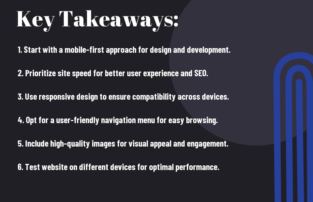
Key Takeaways:
- Mobile Responsiveness: Ensure your e-commerce website is optimized for mobile devices to provide a seamless user experience across all screen sizes.
- Fast Loading Speed: Prioritize speed by optimizing images, minimizing redirects, and leveraging browser caching to enhance user experience and increase conversion rates.
- User-Friendly Design: Focus on a clean and intuitive design with easy navigation to make it simple for customers to browse, select, and purchase products on their mobile devices.

Understanding the Importance of Mobile-Responsive Design
While developing an e-commerce website, one of the crucial aspects to consider is mobile-responsiveness. In today’s digital age, where consumers are always on the go, having a mobile-responsive design is paramount. It ensures that your website adapts seamlessly to various screen sizes and devices, providing a user-friendly experience. To build a successful e-commerce platform, incorporating mobile-responsive design is non-negotiable. For more insights on creating an optimized e-commerce website, check out 7 Essential Elements For E-Commerce Websites.
The Rise of Mobile Shopping
For businesses, adapting to the rise of mobile shopping is important. With the increasing number of consumers using smartphones and tablets to make online purchases, having a mobile-responsive e-commerce website is critical. A mobile-responsive design ensures that your site functions seamlessly on all devices, leading to improved user experience and increased sales.
The Impact on Search Engine Rankings
Understanding the impact of mobile-responsiveness on search engine rankings is vital for the success of your e-commerce website. A mobile-responsive design is favored by search engines like Google, as it provides a better user experience. Websites that are mobile-friendly are likely to rank higher in search results, driving more organic traffic to your site.
Planning Your Mobile-Responsive E-commerce Website
Defining Your Target Audience and Mobile Usage
Some of the most critical steps in planning your mobile-responsive e-commerce website involve defining your target audience and understanding their mobile usage habits. An in-depth analysis of your target demographic will help tailor the design and functionality of your website to meet their specific needs and preferences.
Establishing Your Design and Functional Requirements
An necessary aspect of planning your mobile-responsive e-commerce website is establishing your design and functional requirements. This involves outlining the layout, features, and overall user experience you want to achieve on both desktop and mobile platforms. It is crucial to ensure that your website is not only visually appealing but also user-friendly and easy to navigate.
Establishing a clear roadmap for your website’s design and functionality will help streamline the development process and ensure that your e-commerce platform meets the expectations of your target audience. MobileResponsive design elements such as easy navigation, fast load times, and secure payment gateways are necessary for a successful e-commerce website that caters to mobile users.
Designing for Responsiveness
Flexible Grid Layout Creation
Now, one of the key elements in creating a mobile-responsive e-commerce website is designing a flexible grid layout. A flexible grid layout allows your website to adapt to different screen sizes and resolutions, providing a seamless user experience across various devices. Using percentages instead of fixed pixel values for grid columns can help your website elements adjust dynamically to different screen sizes.
Optimizing Images and Media for Mobile
Images play a crucial role in the visual appeal of your e-commerce website, but they can also slow down the loading speed on mobile devices if not optimized properly. Optimizing images and media for mobile involves reducing file sizes, choosing the right file format, and implementing lazy loading to ensure fast loading times and smooth user experiences.
Designing your website with optimized images and media is important for improving your site’s performance and enhancing user engagement. Remember to test your website on different devices to ensure that images and media are displayed correctly and do not affect loading times negatively.
Technical Aspects of Mobile Responsiveness
Implementing Responsive Frameworks and CSS
Once again, when it comes to developing a mobile-responsive e-commerce website, the use of responsive frameworks like Bootstrap or Foundation is crucial. These frameworks provide a solid foundation for building websites that adapt smoothly to different screen sizes. Additionally, using Cascading Style Sheets (CSS) to define the layout and design of your site is crucial for creating a consistent and visually appealing experience for users across all devices.
Ensuring Cross-Device Compatibility
Aspects of ensuring cross-device compatibility play a vital role in the success of a mobile-responsive e-commerce website. This involves testing your site on various devices, including smartphones, tablets, and desktops, to ensure that it functions seamlessly on all platforms. Ensuring cross-device compatibility not only improves user experience but also helps in enhancing search engine rankings as search engines prioritize mobile-friendly websites.
This step is critical as a website that does not display properly on different devices can lead to a high bounce rate and lower conversion rates. By testing your site thoroughly on different devices and resolutions, you can identify and fix any issues that may arise, ensuring a seamless user experience across the board.

Testing and Optimization
All Ecommerce Website Development: Everything You Need … projects require thorough testing and continuous optimization to ensure a seamless user experience across different devices.
Tools and Techniques for Responsive Testing
An crucial aspect of mobile-responsive e-commerce website development is testing the website across various devices and screen sizes. Tools like BrowserStack, Responsinator, and Chrome DevTools can help simulate how the website appears on different devices. Techniques such as responsive design testing, browser testing, and performance testing are crucial to identify any issues and ensure an optimal user experience.
Ongoing Mobile Experience Optimization
The key to success in mobile e-commerce is ongoing optimization of the mobile experience. Regularly analyzing user behavior, conducting A/B testing, and gathering feedback can help identify areas for improvement. Implementing personalization techniques and ensuring fast loading times are also crucial factors in optimizing the mobile experience.
Techniques for ongoing mobile experience optimization involve constantly monitoring and improving key performance indicators (KPIs) such as conversion rates, bounce rates, and average session duration. By staying proactive and responsive to user needs, e-commerce businesses can ensure a competitive edge in the mobile market.

Marketing and SEO Strategies for Mobile-Responsive E-commerce
Mobile-Focused SEO Practices
On the path to achieving success with your mobile-responsive e-commerce website, focusing on mobile SEO practices is crucial. Optimizing your site for mobile search engines includes techniques like mobile-friendly design, fast page loading speed, and creating quality content specifically tailored for mobile users. Ensure your website is easy to navigate on mobile devices and that your images and videos are optimized for quick loading times. Additionally, prioritize local SEO efforts by including your business location and relevant keywords in your content.
Effective Marketing for Mobile Audiences
Mobile marketing is indispensable in the digital age, especially for e-commerce businesses. Reaching and engaging with mobile audiences effectively requires strategic planning and execution. Utilize mobile-specific advertising channels like social media platforms and mobile apps to connect with your target audience. Furthermore, leverage location-based marketing to target consumers in specific geographical areas. Implement personalized marketing campaigns that resonate with mobile users’ preferences and behavior patterns to drive conversions.
Summing up
Considering all points discussed above, it is evident that following the 7 imperative steps for a mobile-responsive e-commerce website development is crucial for success in the digital marketplace. From conducting research to creating a seamless user experience, implementing effective SEO strategies, and ensuring efficient navigation, each step plays a vital role in optimizing your website for mobile users. By prioritizing mobile responsiveness, you are not only enhancing user satisfaction but also expanding your reach to a broader audience. It is imperative to stay abreast of the latest trends and technologies to stay competitive in the ever-evolving world of e-commerce. Therefore, incorporating these imperative steps will undoubtedly set your e-commerce business on the path to success.
FAQ
Q: What is the importance of having a mobile-responsive e-commerce website?
A: Having a mobile-responsive e-commerce website is crucial in today’s digital world as most users shop on their mobile devices. It ensures a seamless shopping experience and increases customer satisfaction and engagement.
Q: How can I make my e-commerce website mobile-responsive?
A: To make your e-commerce website mobile-responsive, you need to use a responsive web design, optimize images and videos for mobile viewing, and test your website on different devices and screen sizes to ensure compatibility.
Q: Why is website speed important for mobile responsiveness?
A: Website speed is critical for mobile responsiveness as slow loading times can lead to a high bounce rate and loss of customers. Optimizing your website speed by compressing images, minimizing HTTP requests, and using caching techniques is crucial.
What are the best practices for designing a mobile-responsive e-commerce website?
A: Some best practices for designing a mobile-responsive e-commerce website include using a simple and intuitive layout, implementing touch-friendly buttons, ensuring easy navigation, and prioritizing important content for mobile users.
Q: How can I improve the user experience on my mobile e-commerce website?
A: To enhance the user experience on your mobile e-commerce website, you can incorporate features like guest checkout, mobile payment options, personalized recommendations, and seamless integration with social media platforms for easy sharing and engagement.