
Need A Responsive Web Design? Here’s Why It’s Essential.

Need A Shopify Website Design? Here’s What To Consider Before Hiring A Designer.
April 10, 2024
How Can Local Website Designers Help Elevate Your Business?
April 12, 2024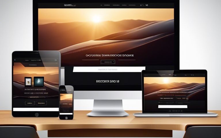
Essential for staying competitive in today’s digital landscape, responsive web design is crucial for reaching and engaging with your target audience effectively. With mobile traffic accounting for a significant portion of website visits, having a responsive design ensures a seamless user experience across all devices. In our blog post, we probe into 10 reasons why responsive web design is not just important but imperative in creating a successful online presence. To learn more about the importance of responsive design, check out our comprehensive blog post 10 Reasons Why Responsive Web Design is Important.
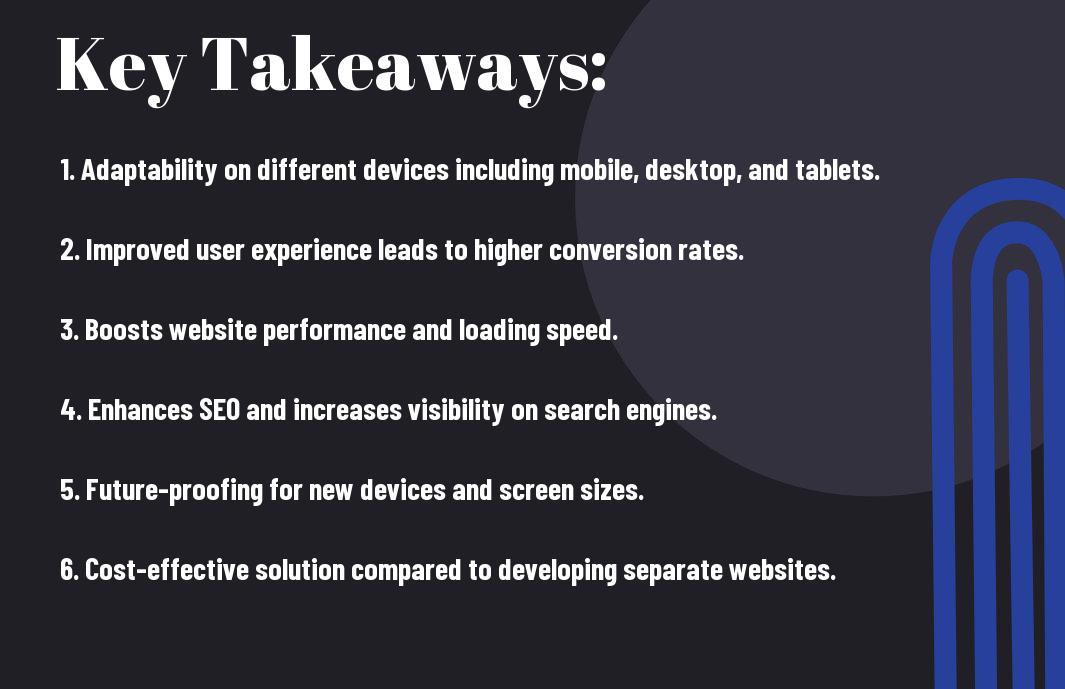
Key Takeaways:
- Enhanced User Experience: Responsive web design ensures that your website looks great and functions well on any device, providing a positive user experience for all visitors.
- Improved SEO: Having a responsive web design is crucial for SEO, as search engines like Google prioritize mobile-friendly websites in their search results, boosting your online visibility.
- Increased Conversion Rates: A responsive website can lead to higher conversion rates, as users are more likely to engage with your content and take desired actions when they can easily navigate your site on any device.
The Rise of Mobile Internet Usage
Even in the past decade, the trend of accessing the internet through mobile devices has seen a significant surge. With the growing popularity of smartphones and tablets, more and more people are using their mobile devices to browse the internet, shop online, read news, connect on social media, and much more.
Mobile Traffic Statistics
Mobile internet usage has surpassed desktop usage, with over 50% of global internet traffic coming from mobile devices. This shift in consumer behavior highlights the importance for businesses to have a mobile-responsive website to cater to their audience effectively.
User Experience on Different Devices
Internet users expect a seamless and consistent browsing experience regardless of the device they are using. A website that is not optimized for mobile devices can lead to high bounce rates, low engagement, and ultimately, loss of potential customers.
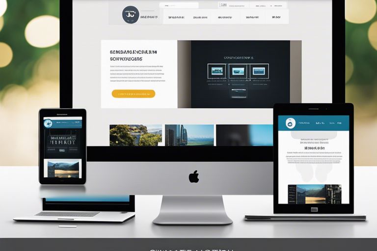
DevicesOne of the critical aspects of user experience on different devices is responsive web design. A responsive website adapts to the screen size and resolution of the device being used, ensuring that the content is displayed correctly and the navigation is user-friendly. This approach not only enhances user experience but also boosts SEO rankings, as search engines prioritize mobile-friendly websites in their results.
Benefits of Responsive Web Design
Unlike What Is Responsive Web Design and Why Is It Important?, responsive web design offers numerous benefits that can greatly impact the performance and success of your website.
Improved User Experience
On the internet, user experience is paramount. A responsive web design ensures that your website looks great and functions seamlessly across all devices, whether it’s a desktop, tablet, or mobile phone. This adaptability leads to higher engagement, lower bounce rates, and ultimately, more conversions as visitors are more likely to stay and interact with your site.
Positive Impact on SEO Rankings
Designing a responsive website has a positive impact on SEO rankings. Search engines like Google favor mobile-friendly websites and often rank them higher in search results. For instance, Google’s mobile-first indexing means that it primarily uses the mobile version of a site for indexing and ranking. Therefore, having a responsive design can improve your website’s visibility and drive more organic traffic to your site.
Implementing Responsive Design
Key Principles and Techniques
To ensure a successful responsive design, it is crucial to follow key principles and techniques. One of the primary principles is to create a design that is fluid and can adapt to different screen sizes. This involves using relative units like percentages rather than fixed units like pixels. Additionally, using media queries to apply different styles based on the screen size is necessary for responsiveness.
Common Challenges and Solutions
With the myriad of devices and screen sizes available today, one common challenge in responsive design is testing across various platforms. Ensuring that the design looks and functions consistently across different devices can be a daunting task. However, utilizing browser developer tools and online emulators can help simulate the experience on different devices.
Understanding the importance of thorough testing is critical in overcoming challenges in responsive design. Not testing the design across multiple devices can result in a poor user experience and negatively impact the site’s performance. Therefore, investing time in testing and implementing solutions for any disparities is crucial for a successful responsive design
Measuring the Success of Responsive Design
Analytics and User Feedback
After implementing a responsive design for your website, it’s crucial to measure its success through analytics and user feedback. Success in this context can be determined by tracking metrics such as bounce rate, time on page, and conversion rates across different devices. Listening to user feedback through surveys, comments, and behavioral analysis can also provide valuable insights into the effectiveness of your responsive design.
Future-Proofing Your Web Presence
Analytics play a key role in future-proofing your web presence. By studying user behavior trends and device usage data, you can make informed decisions about optimizing your responsive design for emerging technologies and devices. It’s vital to stay ahead of the curve and ensure that your website remains relevant and accessible to a diverse audience with varying devices and screen sizes.

To wrap up
Hence, a responsive web design is no longer just a nice addition—it is important for the success of any website. With the increasing use of mobile devices, having a website that is easy to navigate and visually appealing across all screen sizes is crucial. Not only does it enhance user experience and engagement, but it also improves SEO ranking and ultimately leads to higher conversion rates. By investing in a responsive web design, businesses can stay ahead of the competition and ensure that their online presence remains strong and effective in today’s digital landscape.
FAQ
Q: What is responsive web design?
A: Responsive web design is an approach to web design that makes web pages render well on a variety of devices and window or screen sizes.
Q: Why is responsive web design imperative?
A: Responsive web design is imperative because it ensures that your website looks great and functions well on all devices, including desktops, laptops, tablets, and smartphones, providing a seamless user experience.
Q: How does responsive web design improve user experience?
A: Responsive web design improves user experience by ensuring that your website is easy to navigate, read, and use on any device, which can lead to increased engagement and conversion rates.
Q: Does responsive web design affect SEO?
A: Yes, responsive web design can positively impact your SEO efforts because search engines like Google prioritize mobile-friendly websites in their search results, leading to higher visibility and rankings.
Q: What are the key benefits of implementing a responsive web design?
A: Some key benefits of implementing a responsive web design include improved user experience, higher search engine rankings, increased mobile traffic, easier maintenance, and future-proofing your website for new devices and technologies.