
Is Your Website Mobile-Friendly? Discover The Benefits Of Responsive Design.

Is Your Website SEO-Friendly? Boost Your Rankings With Our Redesign Services.
April 25, 2024
What Are The Best Website Builders For Small Business Owners?
April 29, 2024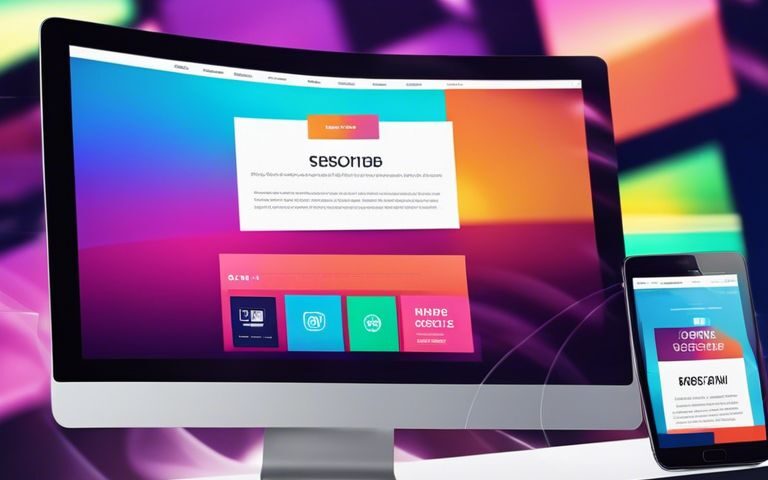
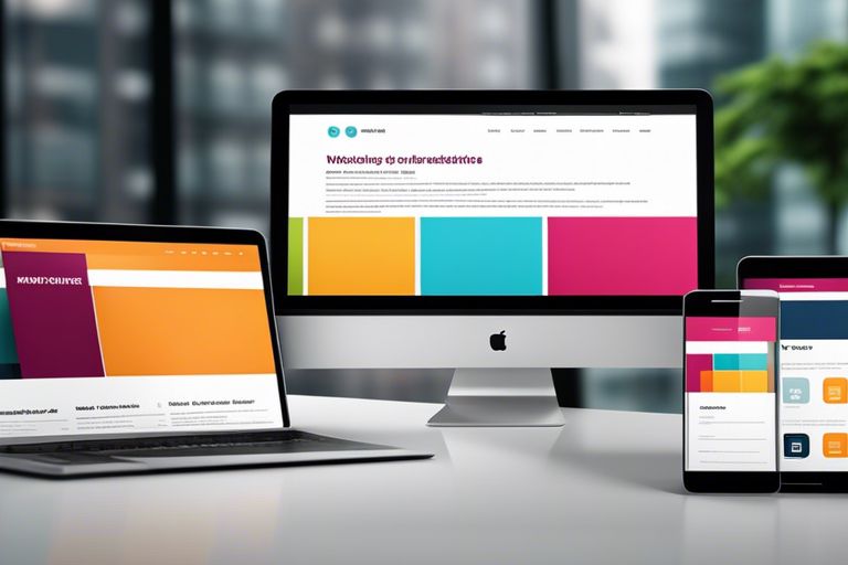
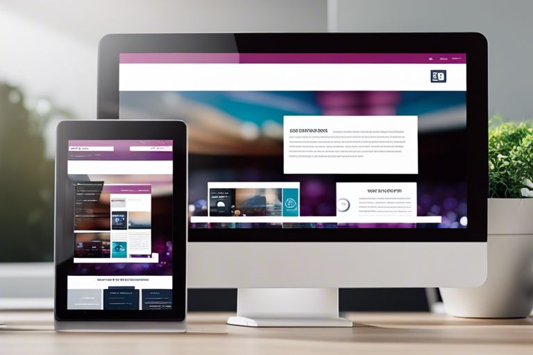
Just how crucial is mobile-friendliness for your website’s success? In today’s digital age, it is absolutely imperative to ensure your website is responsive across all devices. With over half of all internet traffic coming from mobile devices, having a responsive design can boost your SEO ranking, increase customer satisfaction, and maximize conversion rates. This blog post will research deep into the benefits of responsive design, why it matters for your online presence, and how you can leverage this powerful tool to enhance your website’s performance.
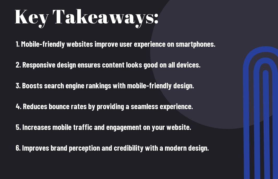
Key Takeaways:
- Improved User Experience: Responsive design ensures a seamless experience across all devices, providing easy navigation and faster load times for users.
- SEO Benefits: Mobile-friendly websites receive a boost in search engine rankings, as search engines prioritize responsive design for mobile users. This can lead to increased visibility and organic traffic.
- Better Conversion Rates: Mobile-friendly websites tend to have higher conversion rates, as users are more likely to engage and make a purchase when they have a positive experience on a mobile device. Responsive design can help optimize the user journey and increase conversions.

Importance of Mobile-Friendly Websites
Some studies have shown that over half of all website traffic comes from mobile devices, making it crucial for businesses to have a mobile-friendly website. Having a responsive web design ensures that your website is optimized for different screen sizes and devices, providing a seamless user experience. To learn more about the significance of responsive web design, check out Why Use Responsive Web Design?.
Enhancing User Experience
With a mobile-friendly website, users can easily navigate your site, access information, and make purchases on their mobile devices without any issues. This leads to higher engagement, lower bounce rates, and ultimately, more conversions for your business.
Improving Search Engine Rankings
With a responsive design, your website is more likely to rank higher in search engine results pages. Google prioritizes mobile-friendly websites in its search algorithm, so having a mobile-optimized site can significantly improve your online visibility. Having a mobile-friendly website is important for SEO success.
Benefits of Responsive Design
Cost-Effectiveness and Maintenance
Now, businesses need to consider the cost-effectiveness and ease of maintenance that responsive design offers. The initial investment in developing a responsive website pays off in the long run by eliminating the need for separate mobile sites. With only one site to update and maintain, businesses can save time and resources that would otherwise be spent on managing multiple versions of their website.
Increased Conversion Rates
With the rise in mobile usage, having a responsive design can significantly boost your website’s conversion rates. The seamless experience across all devices ensures that visitors can easily navigate, engage, and ultimately convert. Responsive design eliminates barriers to conversion that are often faced with non-mobile-friendly sites, such as slow loading times or distorted layouts.
With a responsive design, businesses can also capitalize on the increasing trend of mobile shopping. Mobile users are more likely to make a purchase if they have a positive experience on a website, which is more easily achieved with a responsive design that provides a smooth and user-friendly interface.
Implementing Responsive Design
Key Elements of a Responsive Website
To ensure your website is responsive to all devices, there are key elements that you must consider. These include fluid grids, flexible images, and media queries. Fluid grids allow the content to adapt to different screen sizes, while flexible images resize accordingly. Media queries enable you to set specific styles based on the device’s characteristics, ensuring a seamless user experience across various platforms.
Common Challenges and Solutions
The implementation of responsive design can come with challenges such as complex layouts, performance optimization, and cross-browser compatibility. However, these challenges can be solved by prioritizing simplicity in design, optimizing images and videos for faster loading times, and testing the website on multiple browsers to ensure consistent functionality. By addressing these common challenges proactively, you can create a user-friendly and efficient responsive website that enhances your online presence.
Elements such as fluid grids and media queries are crucial for achieving a responsive design that caters to the diverse range of devices used today. By understanding the key components and addressing common challenges, you can create a responsive website that not only adapts to various screen sizes but also provides a seamless user experience for your visitors.
Summing up
With this in mind, it is crucial for businesses to ensure that their websites are mobile-friendly. The benefits of responsive design are significant, including improved user experience, better SEO rankings, increased mobile traffic, and higher conversion rates. By investing in responsive design, businesses can stay ahead of the curve and cater to the growing number of mobile users. Embracing mobile-friendly websites is not just a trend but a necessity in today’s digital landscape.
FAQ
Q: Why is having a mobile-friendly website important?
A: Having a mobile-friendly website is crucial because the majority of internet users now access websites through mobile devices. If your website is not mobile-friendly, you risk losing potential customers and damaging your online reputation.
Q: What is responsive design?
A: Responsive design is an approach to web design that makes web pages render well on a variety of devices and window or screen sizes. It ensures that users have a seamless experience no matter what device they are using.
Q: How does responsive design benefit my website?
A: Responsive design benefits your website by improving user experience, increasing mobile traffic, boosting your SEO efforts, and saving you time and money on managing multiple versions of your site for different devices.
Q: Can a non-responsive website be converted to a mobile-friendly site?
A: Yes, a non-responsive website can be converted to a mobile-friendly site by redesigning it with responsive design principles. This may involve restructuring the layout, optimizing images and content, and implementing flexible grids and layouts.
Q: How can I test if my website is mobile-friendly?
A: You can test if your website is mobile-friendly by using Google’s Mobile-Friendly Test tool or by simply viewing your website on various mobile devices. Pay attention to the layout, navigation, and overall user experience on different screens to determine its mobile-friendliness.