
7 Essential Steps For A Mobile-Responsive E-commerce Website Development

Redesigning Your Website – Top Strategies For A Fresh And SEO-Friendly Look
March 7, 2024
How To Choose The Right Website Design Company For Your Online Portfolio
March 11, 2024
Over the past decade, mobile commerce has taken over the E-commerce industry by storm. To stay competitive in this digital landscape, having a mobile-responsive E-commerce website is no longer an option but a necessity. In this blog post, we will outline 7 vital steps for developing a mobile-responsive E-commerce website that not only meets the needs of your customers but also helps drive conversion rates. To dive deeper into the world of E-commerce website development, check out Ecommerce Website Development: Everything You Need ….
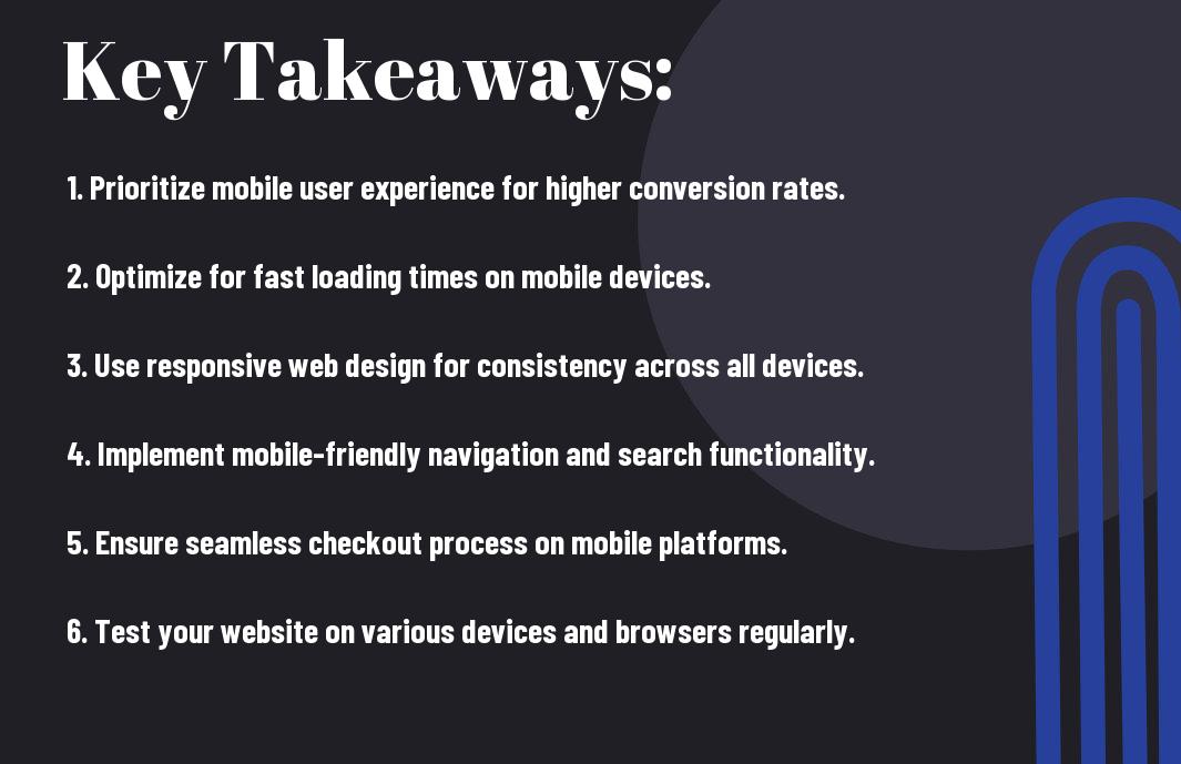
Key Takeaways:
- Responsive Design: Ensure your e-commerce website design is responsive to provide an optimal viewing experience across various devices like mobile phones, tablets, and desktops.
- Mobile-Friendly Navigation: Implement easy-to-use navigation menus and filters that are optimized for mobile devices to enhance user experience and facilitate seamless browsing and purchasing.
- Optimized Checkout Process: Streamline the checkout process by minimizing the number of steps, offering guest checkout options, and optimizing form fields for mobile users to increase conversion rates and reduce cart abandonment.

Understanding Mobile-Responsive Design
Your Seven Steps To An Awesome Website article has inspired you to investigate deeper into mobile-responsive design for e-commerce websites. It’s vital for online businesses to adapt to the increasingly mobile-centric world to stay ahead in the game. Let’s explore the nuances of mobile-responsive design for your e-commerce platform.
The Importance of Mobile Responsiveness
The importance of mobile responsiveness for an e-commerce website cannot be overstated. With more users accessing the internet via smartphones and tablets, having a mobile-responsive design is crucial for providing a seamless browsing experience. A responsive site ensures that your content displays correctly and functions well across all devices, leading to increased customer satisfaction, higher conversion rates, and improved search engine rankings.
Principles of Responsive Web Design
With the Principles of Responsive Web Design, your website will adapt effortlessly to different screen sizes and resolutions, offering a consistent user experience. This involves using flexible grids and layouts, fluid images, and media queries to create a design that responds to the user’s behavior and environment. By following these principles, you can ensure that your e-commerce website looks great and functions flawlessly on any device, enhancing usability and driving business growth.
Planning Your Mobile-Responsive E-commerce Site
Setting Goals and Objectives
Little can happen without a clear roadmap for your e-commerce website. Before stepping into development, take the time to establish clear goals and objectives for your mobile-responsive site. Define what you aim to achieve with your online store, whether it’s increasing sales, improving user experience, or expanding your customer base.
Researching Target Audience and Mobile Usage Patterns
Any successful e-commerce venture requires a deep understanding of your target audience and their mobile usage habits. Conduct thorough research to identify your potential customers, their preferences, and how they interact with mobile devices during the shopping process. This insight will help guide your design and marketing decisions to create a more effective e-commerce site.
Site research involves analyzing demographic data, purchasing behaviors, and popular mobile devices among your target audience. By understanding these patterns, you can tailor your site to appeal to your customers’ preferences and optimize for mobile devices they use.
Designing for Mobile Responsiveness
Despite the increasing dominance of mobile devices in online shopping, many e-commerce websites still struggle with creating a seamless mobile user experience. To address this challenge, it’s crucial for businesses to prioritize mobile responsiveness in their website design. If you’re looking to learn more about How to Create Responsive Web Design for eCommerce, check out this comprehensive guide.
Navigational Considerations for Smaller Screens
Screens on mobile devices are significantly smaller than those on desktops, which means that you need to carefully consider your website’s navigation. It’s important to prioritize the most important elements and simplify the menu options for easy access. Implementing a sticky header or a collapsible menu can help users easily navigate through your site without feeling overwhelmed.
Designing with Mobile-First Approach
Considerations for a mobile-first approach involve designing your website for mobile devices first before adapting it to larger screens. This approach ensures that your site delivers the best user experience on mobile, where the majority of your traffic is likely coming from. By focusing on mobile-first design, you can create a more streamlined and efficient browsing experience for your customers.
Designing with a mobile-first approach also encourages you to prioritize imperative content and features, making sure they are prominently displayed on smaller screens. It forces you to think about load times, image sizes, and overall user experience, leading to a more optimized website across all devices.
Implementing Responsive Technical Features
Adaptive Layouts and Grid Systems
One crucial aspect of developing a mobile-responsive e-commerce website is the implementation of adaptive layouts and grid systems. A fluid grid system allows web elements to resize proportionally based on the user’s device, ensuring a seamless browsing experience across various screen sizes and resolutions.
Optimizing Images and Media for Mobile
Features like responsive images and videos are necessary for ensuring fast loading times and optimal performance on mobile devices. By optimizing images and media for mobile, you can enhance user experience and reduce bounce rates. Utilizing compressed images and lazy loading can significantly improve site speed and overall responsiveness.
Understanding the importance of these technical features will not only improve user experience but also positively impact your website’s SEO rankings. By implementing adaptive layouts, grid systems, and optimizing images and media for mobile devices, you can create a seamless and engaging shopping experience for your customers, ultimately leading to increased conversions and sales.

Testing and Optimizing the Mobile Experience
Tools for Testing Mobile Responsiveness
Now, when it comes to ensuring your e-commerce website delivers a seamless mobile experience, using the right tools for testing is crucial. Tools like Google’s Mobile-Friendly Test, BrowserStack, and Responsinator can help you assess how your site appears and functions across various mobile devices and screen sizes. These tools provide valuable insights that enable you to identify and address any issues that may impact the user experience.
Performance Optimization Strategies
To enhance the performance of your mobile e-commerce website, it’s vital to implement performance optimization strategies. From optimizing images and minifying CSS and JavaScript files to leveraging browser caching and using a content delivery network (CDN), there are numerous tactics you can employ to improve loading speeds and overall performance. By implementing these strategies, you can ensure that your website loads quickly and efficiently on mobile devices, thereby enhancing user satisfaction and driving conversions.
Performance optimization is not just about speed; it also impacts your search engine ranking. Search engines like Google consider page speed as a ranking factor, so a faster-loading website can positively influence your SEO efforts. Additionally, a smooth browsing experience can help reduce bounce rates and increase user engagement, leading to higher conversion rates. Invest time and resources in optimizing your site’s performance to stay ahead in the competitive e-commerce landscape.

Maintaining Mobile Responsiveness
Regular Updates and Iterative Improvements
Not updating your mobile e-commerce website regularly can lead to compatibility issues, slow performance, and potential security vulnerabilities. It is crucial to schedule regular updates and iterative improvements to ensure that your website remains responsive across various devices and browsers. By consistently optimizing and testing your website, you can provide a seamless shopping experience for your mobile customers.
Adapting to New Mobile Trends and Technologies
For an e-commerce website to stay mobile-responsive, it must adapt to new mobile trends and technologies. One must stay updated with the latest features, design trends, and user behaviors to ensure that the website remains competitive and appealing to mobile users. By investing in continuous learning and staying ahead of the curve, you can leverage emerging technologies like Progressive Web Apps (PWAs) and mobile-first design principles to enhance the mobile shopping experience.
Trends in mobile technology are always evolving, and it is imperative for e-commerce businesses to stay informed and proactive in embracing these changes. By monitoring consumer behavior, studying industry reports, and adapting to new technologies, businesses can position themselves for success in the competitive mobile commerce landscape.
Final Words
Now you have the vital steps to develop a mobile-responsive e-commerce website at your fingertips. By implementing these strategies, you can ensure that your site is optimized for users on all devices, leading to increased traffic, engagement, and sales. Remember to prioritize user experience, optimize for mobile speed, and test your site regularly to ensure it functions seamlessly across various screens. Keep up with the latest trends and technologies to stay ahead in the competitive e-commerce landscape. With dedication and attention to detail, your mobile-responsive website will be a powerful tool for driving business success in the digital age.
FAQ
Q: Why is mobile responsiveness important for an e-commerce website?
A: Mobile responsiveness is crucial for an e-commerce website because a large percentage of online shoppers use mobile devices to browse and make purchases. Failing to have a mobile-responsive design can result in a poor user experience, leading to lower conversion rates and lost sales.
Q: What are the benefits of having a mobile-responsive e-commerce website?
A: Some of the benefits of having a mobile-responsive e-commerce website include improved user experience, higher search engine rankings, increased mobile traffic, higher conversion rates, and the ability to reach a larger audience of mobile users.
Q: How can I make my e-commerce website mobile-responsive?
A: To make your e-commerce website mobile-responsive, you can follow these important steps: 1. Use a responsive design framework, 2. Optimize images and videos for mobile viewing, 3. Prioritize mobile-friendly navigation, 4. Ensure fast loading times on mobile devices, 5. Test your website on various devices and screen sizes, 6. Implement mobile-friendly forms, 7. Provide a seamless checkout process for mobile users.
Q: What is a responsive design framework?
A: A responsive design framework is a collection of pre-written code that helps developers create responsive websites more efficiently. Popular responsive design frameworks include Bootstrap, Foundation, and Materialize, which provide a grid system, CSS styles, and JavaScript components that adapt to different screen sizes.
Q: How can I test the mobile-responsiveness of my e-commerce website?
A: You can test the mobile-responsiveness of your e-commerce website using tools like Google’s Mobile-Friendly Test, Responsinator, BrowserStack, or by physically testing your website on various mobile devices and screen sizes. It’s important to regularly test and optimize your website for mobile responsiveness to ensure a seamless user experience across all devices.